Minor Project: Haelan Herbs
04/04/2023 - 16/07/2023 ( Week 01 - Week 15)
ALICIA TENG YI LING / 0345159 / BDCM
MINOR PROJECT: Haelan Herbs

Instructions
Important Links
MIRO Board
Final Project Document
Task 01: Proposal
Week 01: Topic Selection & Contextual Research
In this module, our project entails collaborating with a brand to develop a
comprehensive brand identity design solution for their product marketing. As
part of the project requirements, we formed a group comprising 6-7
individuals with various specializations to effectively carry out the
project tasks. My group is made up of Adena and Adeline from Graphic Design,
Yi Ki and Adlina from Digital Animation, Sasiliva from Entertainment Design
and myself from UI/UX Design. After being given a list of collaborators to
choose from, we opted to work on Brandialogue's brief, which involves
creating a brand identity for an apothecary brand specializing in
Traditional Chinese Medicine (TCM), Ayurveda herbs, and agarwood products.
My Contextual Research

|
|
Fig 1.1 Assigned tasks for contextual research |
| Fig 1.2 My research for current trends in the parenting and family product market with source links |

|
|
Fig 1.3 My notes on MIRO Board |
To initiate the project, we started on contextual research, utilizing online
resources to gather valuable information related to our topic. Through
collaborative discussions, we determined the specific areas to focus our
research on, including future and past trends, market size and growth in the
herbal industry, competitor analysis, and customer reviews. To ensure
efficiency, we divided these research tasks among our team members, allowing
us to cover a broader scope while maximizing individual expertise.
In my assigned section, I focused on conducting research specifically on the
current trends within the parenting and family product market. By delving
into this area, our aim was to gain a deeper understanding of the market
dynamics and identify opportunities for our brand's potential success. Thus,
I analysed various factors such as emerging trends, consumer preferences,
and market demands to assess how well our brand aligns with the current
landscape. This research played a crucial role in helping us evaluate the
viability and potential prospects for our brand

|
|
Fig 1.4 Everyone's contextual research summary |
Meeting with Mr. Damien
During week 2, we had the opportunity to meet with Mr. Damien, who
introduced us to the product manufactured by their company, OUD incense
sticks. He provided us with a comprehensive overview of the project
requirements, which encompassed various aspects such as developing a
compelling brand story, designing packaging, creating a website, and more.
Additionally, we engaged in a productive discussion regarding a planned
visit to the Dadvance Agarwood Solutions Sdn Bhd store located in Bukit
Jalil. Together, we determined a mutually convenient date and time for the
visit, and subsequently confirmed these details with Mr. Damien. This
interaction allowed us to gain a deeper understanding of the product,
project scope, and the upcoming site visit, setting the stage for further
progress in our collaboration.
Weeks 02 - 03 Persona and Questionnaire Questions
Following the feedback provided by Mr. Mike, we proceeded with our project's
progress, focusing on defining our target persona and formulating insightful
interview questions. Incorporating the feedback received, we refined our
understanding of the target audience and their needs.
To start, we identified and defined our target personas in a concise and
practical manner for our research purposes. These personas included
individuals who currently use herbal products, those who are new to them,
individuals who have not yet tried herbal products, and mothers of newborns.
As a team, we engaged in collaborative discussions to develop detailed
profiles for each persona and crafted specific interview questions tailored
to their unique perspectives and experiences. Additionally, we incorporated
a set of general questions to obtain a broader overview across all personas.
After receiving feedback from Mr. Mike regarding our personas, we used color
highlighting on sticky notes to indicate the selected questions that would
be included in our final Google form. Furthermore, we compiled a list of
potential interviewees whom we could approach to gather their insights and
responses based on the formulated questions.

|
|
Fig 2.1 Persona Profiles on MIRO Board |

|
|
Fig 2.2 Draft Questions on MIRO |
After receiving feedback from Mr. Mike during week 3, we made some important
adjustments to our Google form format. Instead of targeting specific
interviewees, we decided to transform it into an open questionnaire
accessible to everyone. This modification was necessary as conducting
face-to-face interviews with all participants was not feasible. In line with
Mr. Mike's feedback, we also refined the sentence structures of certain
questions and introduced multiple-choice answers, checkboxes, and short and
long text response formats.
To streamline the questionnaire experience, we designed it in such a way
that respondents would be directed to specific persona group questions based
on their answer to question 8 in the general questions section. This allowed
for a more targeted and relevant approach, ensuring that participants only
answered questions relevant to their specific circumstances. For respondents
who indicated that they were not familiar with or currently using herbal
products, they were given the option to submit the form directly, saving
them from unnecessary questions.
At the beginning of the questionnaire, we incorporated a brief introduction
to familiarize our respondents with herbal products and provide a clear
definition. This introductory section aimed to ensure that participants have
a common understanding of what constitutes herbal products as they proceed
to answer the subsequent questions. We also looked for images that could
help respondents understand the types of herbal fields we are looking to
research. I searched for TCM herbs, Yi Ki searched for Ayurveda herbs and
Sasilvia searched for agarwood and other examples. Lastly, Sasilvia compiled
all the images so it looked neat and cohesive.
In addition, we sought out relevant images that could aid respondents in
understanding the various types of herbal fields we are researching. I
focused on finding images depicting TCM herbs, while Yi Ki searched for
Ayurveda herbs, and Sasilvia looked for images of agarwood and other related
examples. Finally, Sasilvia took on the task of compiling all the images,
ensuring a visually appealing and cohesive presentation.
|
Fig 2.3 Initial Draft (Week 2) vs. Revised Version (Week 3) of
Google Form Questions |
Fig 2.4 Screenshots of whole questionnaire

|
|
Fig 2.5 My sharing of the Questionnaire on my social media |
Once the questionnaire was finalized, we took proactive measures to
promote its reach and garner responses. Each team member shared the
questionnaire link through personal contacts, social media platforms,
and various online channels. I personally shared the questionnaire with
my friends, family, and across my social media networks like Instagram.
We aimed at maximizing participation and obtaining a diverse range of
responses, particularly for our persona 4 group. By leveraging multiple
channels and engaging with different communities, we sought to gather a
substantial number of responses to enrich our research and analysis.
Week 04 Data Analysis & Site Visit
| Fig 3.1 Yi Ki's Data Analysis Notes |
By the beginning of week 4, we had received a total of 164 responses on
our Google Form. I contributed by assisting in sorting the latest data
based on age and persona group within the Google Sheet. These
collaborative efforts ensured a comprehensive and up-to-date analysis of
the collected data, enabling us to present meaningful insights to Mr.
Mike. I helped Yi Ki finish categorising the later end of
responses as she started off by sorting the raw data based on age
and persona group.
We conducted a site visit to D'advance Agarwood Solutions shop in Bukit
Jalil, where Mr. Damien graciously guided us through the experience. Ms.
Zaiqi joined us during the visit and provided us with a comprehensive
explanation of their agarwood products. She shared insights about the
agarwood market, their target audience, customer reviews, and the brand's
commitment to transparency. During the visit, we had the opportunity to
explore and even test some of their featured products, including essential
oils, agarwood oil, skincare items, agarwood leaf tea, agarwood chips,
incense sticks, terrariums, sculptures, candles, bracelets, coffee, and
powder, all infused with agarwood essence.
Throughout the visit, Ms. Zaiqi addressed our inquiries. Adeline, Yi Ki
and I took charge of capturing captivating photographs and videos of the
shop and its diverse range of products. Meanwhile, Adena recorded detailed
notes of the valuable information shared during the visit.
Link to the site visit photos Yi Ki and I took:

|
|
Fig 3.2 Site Visit Photo I |

|
|
Fig 3.3 Site Visit Photo II |

|
|
Fig 3.4 My Group Members |
User Journey Map
During a face-to-face meeting, we came together as a team to collaboratively
create the User Journey Map. This interactive session allowed us to
collectively brainstorm and outline the key contents of the map. We
discussed each stage of the user journey, identified important touchpoints,
and determined the corresponding user actions and emotions. By working
together, we were able to capture a comprehensive representation of the
user's experience, ensuring that all relevant aspects were considered.
 | |
|
Final Submission Haelan Herbs Proposal
| Fig 3.6 Final Haelan Herbs Proposal Presentation |
Task 02: Devise and produce design management protocols relevant with
industry practice
Task 2 entailed the creation of a Gantt chart to effectively assign and
organize task roles within our team. Adena, our group leader, took the
lead in developing the chart and ensured that the roles and
responsibilities were clearly defined. She then sought feedback from the
team members to ensure that everyone was comfortable and in agreement
with their assigned tasks.
As the member specialising in UI/UX, I selected the tasks associated
with prototyping and wireframing the e-commerce platform. Given that we
decided to develop a website for our project, I focused on creating
intuitive and user-friendly interfaces. This involved designing
wireframes and visual prototypes that effectively showcased the layout,
navigation, and overall user experience of the website. By actively
taking on these responsibilities, I aimed to contribute to the seamless
and engaging design of the e-commerce platform, aligning it with our
project goals and user requirements. This includes loading,
landing, about, shop, product, checkout, curated journey process,
FAQ, contact sign up / log in, customer profile pages and a side menu.
As an integral part of our design process, we adopted a collaborative
approach by establishing a shared Pinterest board among all team
members. This board served as a central space where we could collect and
curate a wide range of inspiration and references related to various
aspects of our project. We utilized the board to gather ideas for social
media visuals, collaterals, brand guidelines, products, and UI/UX
elements. By collaboratively populating the Pinterest board with visual
inspiration, we aimed to foster a cohesive design direction, ensuring
that our creative decisions were informed by a diverse range of
perspectives and concepts.

|
|
Fig 4.1 Minor Project Shared Pinterest Board |

|
|
Fig 4.2 UI/UX Pinterest Board |
Website Wireframes
To initiate the design process, I compiled a comprehensive list of key
features and details that demanded attention to ensure an optimal
website structure, well-placed content, and a seamless user
experience.
The essential aspects I prioritized include:
- Overall Structure:
- Defining the foundational framework, including the arrangement of headers, footers, sidebars, and content sections.
- Content Placement:
- Strategically positioning various content elements to achieve visual balance, readability, and logical flow.
- User Experience (UX):
- Enhancing the overall user experience by focusing on intuitive navigation, clear information architecture, and engaging interaction design.
- Visual Design Elements:
- Selecting and implementing an appealing color palette, typography styles, imagery, and graphic elements to create a cohesive visual identity.
- Call-to-Action (CTA):
- Thoughtfully placing CTAs throughout the website to encourage user engagement, conversions, and goal completion.

|
|
Fig 5.1.1 Overview of Pages |
Initial Issue Encountered
At first, I designed the pages using full HD dimensions (1920 x 1080).
However, when testing the pages on various devices with different screen
sizes, I encountered challenges in achieving a seamless fit. Despite
making adjustments and alterations to adapt the design to different
sizes, the pages didn't align properly on multiple devices.
Recognizing the need to address this issue, I adopted a device-centric
approach. I selected a classic MacBook 16 Pro as the model to present
the pages. By focusing on a specific device, I ensured that the design
and layout would be optimized for this particular screen size and
resolution. This approach allowed me to showcase the pages in a way that
accurately represented their intended visual and interactive elements,
mitigating the inconsistencies experienced across different devices.

|
|
Fig 5.2.1 Old vs Current Wireframe Dimensions |
Moving on, I will highlight the primary objectives and
functionalities of each page, ensuring that users can navigate the
website effectively and find the information or services they are
seeking.
Loading Page
The loading page features a minimalist logo positioned in the center,
gradually fading in opacity. Once the loading process is complete, the
landing page elegantly swipes up, inviting the user to enter the
immersive website experience.

|
|
Fig 5.3.1 Loading Page |
To engage visitors and guide them through the website, showcasing
popular products and inviting them to explore the curated journey
process.
Includes:
- Prominent call-to-action button for easy access to the online shop
- Curated journey process button for personalized experiences
- Horizontal scrolling carousel showcasing popular products
- OUD Kickstarter campaign to invite user support + button to Kickstarter website page
- Horizontal scrolling customer testimonials for social proof and to build trust
- Convenient footer with hyperlinks to each page for easy navigation on every page

|
|
Fig 5.4.1 Landing Page |
Side Menu
The side menu serves as a vital navigational element within the website,
providing users with convenient access to various sections and enhancing
the overall user experience. Positioned strategically, the side menu
remains easily accessible throughout the user's journey, allowing them
to navigate effortlessly between different pages or sections of the
website.
Includes:
- Static navbar section featuring links to each page
- Horizontally scrollable images of each page with corresponding titles

|
|
Fig 5.5.1 Side Menu |
About Page
To provide a compelling narrative about the company, its origins,
mission, and values, while showcasing the team members and establishing
credibility.
Includes:
- Engaging introductory video
- Detailed explanations of brand origins and mission
- Highlighting core values such as sustainability, quality, and customer satisfaction
- Team members introduction and awards showcase
- Captivating horizontal gallery of images illustrating sustainable farming and harvesting processes

|
|
Fig 5.6.1 About Page |
Shop Pages
To showcase and offer a seamless shopping experience for the OUD
Kickstarter products, with convenient sorting, presentation and product
details.
Includes:
- Two pages showcasing OUD Kickstarter products
- Favouriting option for tracking interested products
- Immediate display of product price, rating, and number of reviews for informed decision making
- User-friendly UI buttons for seamless page navigation
- Heart icon that users can tap to favourite the product / put in wish list
- Clear product categorization for effortless navigation

|
|
Fig 5.7.1 Shop Page I |

|
|
Fig 5.7.2 Shop Page II |
Product Page
To provide detailed information about each product, including
descriptions, images, variations, and customer reviews, facilitating
informed purchasing decisions.
Includes:
- High-resolution product images for a detailed view
- Comprehensive product descriptions, including key features and benefits
- Interactive product variants selection (e.g., size, color, fragrance)
- Additional product information, such as ingredients
- Dropdown menu to choose product variation
- Counter button to select product quantity
- Add to cart button
- Clicking on the "buy now" button takes user to checkout page

|
|
Fig 5.8.1 Product Page |
Checkout Page
To facilitate secure and efficient order processing, including payment
options, order summary, and shipment details, ensuring a smooth
transaction.
Includes:
- Secure payment gateway options for convenient transactions
- Payment options UI to swap between choices
- Automatic calculation of total order cost, including taxes and shipping fees
- Order summary and breakdown of items, quantities, and prices
- Clicking "Purchase now" button activates a confirmation popup overlay message

|
|
Fig 5.9.1 Checkout Page |
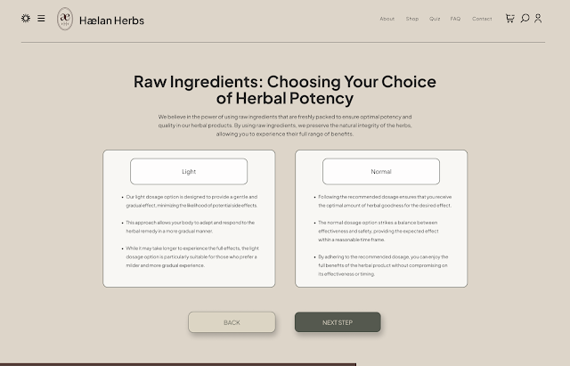
Curated Journey Processes
The purpose of the curated journey process is to guide users through a
personalized and tailored experience based on their specific health concerns
and preferences. It aims to provide valuable insights and recommendations
related to herbal products, allowing users to explore suitable options and
make informed choices. The curated journey process helps users understand
how herbal remedies can address their individual needs and supports them in
their journey towards natural health and well-being.
Includes:
- Nine sections guiding users through a personalized experience
- Introduction, personal details, and general health concerns
- Specific health concerns based on previous answers
- Preferred herbal consumption and potency choices
- Options for type of purchase and additional health details
- Results and recommendations based on user input
- Dropdown menu to allow users to choose their gender option
- Varieties of buttons to select answers and also move between pages
- Loading bar at the bottom indicates amount of progress done

|
|
Fig 5.11.1 Curated Journey Process Page 1 |

|
|
|

|
|
|

|
|
|

|
|
|
|
|
|

|
|
|

|
|
|

|
|
Fig 5.11.9 Curated Journey Process Page 9 |
FAQ Page
To address common questions and concerns users may have, providing helpful
answers and promoting self-service support for a smoother user experience.
Includes:
- Sections covering ingredients, sustainable practices, shipping, and policies
- Comprehensive list of frequently asked questions and their answers
- Accordion-style layout for easy navigation and reading
- Clicking on the - / + enables a dropdown function to reveal the answer to the question
- Clicking again folds the answer back
- Clear categorization of topics for quick access to relevant information
- Opportunity for users to submit additional questions or concerns for future updates
-
- Clicking "submit" button activates a confirmation popup overlay message
 |
Fig 5.12.1 FAQ Page |
Contact Us Page
To provide a communication channel for users to inquire about products or the
company, offering a convenient form for submitting inquiries.
Includes:
- Submission form for user inquiries
- Easy communication channel for product or company-related queries
- Auto-response or confirmation message upon form submission
- Clicking "submit" button activates a confirmation popup overlay message
 |
Fig 5.13 Contact Us Page |
Sign up / Log in Page
To enable users to create an account, providing access to personalized
settings, order history, and loyalty program benefits.
Includes:
- Account creation for new users
- Easy registration process with minimal required information
- Clicking on the "Log in" button will take the user to the customer profile page
 |
Fig 5.14.1 Sign up / Log in Page |
Customer Profile Page
To allow users to manage their account details, such as shipping addresses,
payment methods, and communication preferences, for a personalized experience.
Includes:
- Overview of account details, such as name, email, and membership status
- Shipping address and preferred payment method management
- Ability to update shipping address and payment methods
- Rewards or loyalty program information and point balance
- Clicking on the "change account" button will take the user to the Sign up / Log in Page
 |
Fig 5.15.1 Customer Profile Page |
I noted down the points to provide a more comprehensive overview of the
features and functionalities that users can expect on each page. I also
wrote brief summaries of the key features for each page, providing an
overview. These summaries highlight the primary objectives and
functionalities of each page, ensuring that users can navigate the website
effectively and find the information or services they are seeking.
I hope that the functional aspects ensure that each page serves its purpose
effectively, providing users with the necessary tools, information, and
functionality to navigate the website, explore products, make informed
decisions, and interact with the brand.
Kickstarter
For this wireframe, Adena, our group leader, took the lead in constructing the elements. I incorporated their work into the Figma wireframe and added a functional button in the header to link our website prototype wireframe to the Kickstarter website page. To enhance the realism of the wireframe, I included a screenshot of the website bar from my own MacBook, which contributed to a more authentic representation of the user interface.
 |
Fig 5.16.1 Kickstarter Page |
Working Figma file
| Fig 5.17.1 Working Figma File |
Components
Utilizing Figma's software capabilities, I leveraged its component system to
create reusable elements that can be easily implemented across various pages
of the website, streamlining the prototyping process and enhancing
interactivity and realism.

|
|
Fig 6.1 Overview of Components |
The key features I developed include:
- Custom navigation bars:
- Consistent navigation elements designed to maintain a cohesive user experience throughout the website.
- Side menu hover feature
- Provides visual active feedback for the user to view where their cursor is, enabling ease of navigation.
- Dropdown menus
- Allows users to choose their preferred option out of multiple choices.
- Dropdown info
- For an accordion-style information layout.
- Payment Options UI
- To allow users to select whichever payment option is most convenient and accessible for their purchase.
- Dynamic image carousels:
- Sliding image galleries that showcase multiple visuals or product variations, allowing users to explore content or options.
- Modal windows and overlays:
- Pop-up windows or overlays that display additional information, notifications, or interactive content.
- Yes / no toggle buttons
- For users to actively focus on the option they must choose for specific questions.
- Counter Button
- For users to select the desired quantity of product in an interactive manner.
- Interactive buttons:
- Engaging and clickable buttons that provide visual feedback upon interaction, enhancing user engagement (three states: enabled, hover, pressed).
- Heart animation / favouriting option
- Provides visual feedback to show the user their favourite products in a fun, appealing manner.
- Animated transitions:
- Smooth and visually pleasing transitions between pages or elements, enhancing the overall user experience.

|
|
Fig 6.2 Navigation Bar |

|
|
Fig 6.3 Side menu hover feature |

|
|
Fig 6.4 Dropdown menu 1 (curated journey process page) |

|
|
Fig 6.5 Dropdown menu 2 (product page) |

|
|
Fig 6.6 Dropdown info (FAQ page) |

|
|
Fig 6.7 Payment options UI (checkout page) |

|
|
Fig 6.8 Confirmation popup overlay 1 |

|
|
|

|
|
Fig 6.10 Yes/no toggle button (curated journey process) |

|
|
Fig 6.11 Quantity Counter Button (product page) |

|
|
Fig 6.12 Button 1 |

|
|
|

|
|
|

|
|
|
|
|
|

|
|
|
By utilizing these Figma components, I have created a library of design
elements that can be easily reused and customized, allowing for consistent
and efficient prototyping across different pages of the website. This
approach not only saves time but also adds depth and realism to the user
experience.
Prototyping Process
 |
7.1 Overview of Prototyping Stage |
For page transitions, I primarily utilized the dissolve animation with an ease-out style, setting the transition duration between 200ms to 800ms. In some cases, I also incorporated slide left or slide right animations with an ease-out style, ensuring smooth transitions within a duration of 300ms to 600ms. To replicate the experience of navigating between actual website pages, I implemented a reset of the scroll position and component state between each page transition. This approach created a refreshed and new page appearance, resembling the natural behavior observed when moving between different sections of a real website.
During the prototyping process, I encountered a challenge related to ensuring consistent functionality across repeated features. To address this issue, I adopted a systematic approach by thoroughly reviewing each page and feature to ensure no elements were missed during prototyping. While I made careful efforts to cover all necessary interactions, occasional oversights did occur. However, I identified and rectified these oversights during testing and subsequent iterations, ensuring that all elements received the required functionality.
I displayed some of the more diverse component prototyping I did below.
They are:
- Side menu hovering animation prototyping
- Dropdown menu animation prototyping
- Changing payment options UI animation prototyping
- Counter button animation prototyping
- Interactive button states prototyping
- Heart animation prototyping
 |
Fig 7.2.1 Side menu hovering |
 |
Fig 7.2.2 Dropdown menu I |
 |
Fig 7.2.3 Dropdown menu II |
 |
Fig 7.2.4 Payment options UI |
 |
Fig 7.2.5 Counter button |
 |
Fig 7.2.6 Interactive button states |
 |
Fig 7.2.7 Heart animation |
Test Video Walkthrough
Fig 8.1 Test Video Walkthrough
Updated Website Video Walkthrough

|
|
Fig 8.2.1 Video Editing in Premiere Pro Workspace |
|
Fig 8.2.2 Updated Website VideoWalkthrough |
After addressing and resolving the recurring issues that arose during the
development process, I proceeded to record the final video walkthrough of the
website. This video showcases the polished version of the website,
highlighting its refined design, smooth functionality, and seamless user
experience. The final video walkthrough serves as a comprehensive
demonstration of the website's key features.
One limitation I encountered while using Figma's prototype presentation view
is the requirement to click and drag with the mouse to navigate the pages,
which can result in jerky and unnatural movements during screen recordings.
This posed some challenges for me during the recording process. However, to
mitigate this issue, I adjusted the speed duration of the recording to 220%,
which helped to smoothen the transitions and enhance the overall viewing
experience. Despite this minor inconvenience, I was able to effectively
showcase the website's functionality and design through the recorded
walkthrough.
To enhance the visual appeal of the screen recording, I incorporated an
adjustment layer to adjust the colors and contrast. This adjustment helped to
counteract any dullness or darkening caused by the recording process, ensuring
a more vibrant and engaging visual experience. Furthermore, I applied a
sharpen effect (22%) to improve the overall video quality and clarity. To
create a soothing ambiance, I also included background music that complements
the content and enhances the overall viewing experience.
Task 03: Produce the final presentation of the proposed solution to a panel of
reviewers
Final Haelan Herbs Presentation Deck
| Fig 9.1 Final Haelan Herbs Presentation Deck |
Final Haelan Herbs Website Prototype
| Fig 9.2 Final Haelan Herbs Website Prototype |
Final Submission Haelan Herbs Website Walkthrough
| Fig 9.3 Final Haelan Herbs Walkthrough |
Final Project Tracking Document
Links to my Group Members e-Portfolios:
Feedback
All feedback available in the project tracking document linked above!
Reflection
Week 01
In this week, we were briefed on the MIB by Mr. Mike who then introduced the available brand projects to the class. Immediately, I was interested in “Apothecary” as someone who believes strongly in self-care, uses TCM and has ayurvedic practices. Another project I considered was “Feng Shui” as it similarly fell into my area of personal interests. As Mr. Mike explained more about the brands and gave an explanation as to what we would have to do, I found myself leaning more towards the first topic. Following this, my nearby classmates and I discussed which topic we would like to do, luckily we had similar thoughts. We still needed to find three more people and Mr. Mike said we could group with those who were in the Tuesday class so we decided to wait. Eventually, we formed a group of six with Yi Ki, Sasiliva and Adlina. Next, we had to select a group leader and considering the fact that all of us have previous experiences being one, we had no qualms who it would be. Thus, we spun a digital wheel and it landed on Adena. Following this, we tasked ourselves to start on the contextual research regarding competitors, trends, market growth, potential opportunities and limitations that would aid us with our next step, user personas.
Week 02
This week, to start off during our Monday session, Adena, Adeline and I went to gather feedback on our progress from Mr. Mike. We were asked to summarise the information we found in our MIRO board and present it. Soon after, we updated our Tuesday group members of the updates we garnered. Then on Friday, we had a meeting with Mr. Damien who explained the vision for the brand and what type of packaging this would entail. He even brought a sample product that we were able to study and keep. He also talked more about the lifestyle that ‘Apothecary’ would aim to inspire and imbue in its users and audience, saying that it is more than just a product and more so an active way of thinking. My group then set up a time and date for visiting their site in Bukit Jalil. We managed to settle on Friday in the next two weeks at 2PM that would suit everyone’s schedule. Following that, our group moved to a private library room to discuss the user personas we wanted for the brand. It was an engaging and thought provoking experience to have to craft a realistic persona with different interests and needs and how it would entail the need for ‘Apothecary’.
Week 03
During week 3, I was absent for the Monday class as I was not feeling well. Later I caught up with the feedback from my lovely group members regarding the personas and the online questionnaire we wish to send out. Once it was amended and final changes were made, the go ahead was given to distribute it. Following this, all of us blasted out the questionnaire on several social media websites. Personally, I shared it mostly on my personal Instagram profile and amongst family and friends chats as I have an older sister with many acquaintances that fit one of the persona’s we are looking for (pregnant and newborn mothers). Additionally, I managed to meet with several of my sister’s friends who are newborn mothers that have knowledge of and prefer using herbal products and practices and I managed to collect their data for the online questionnaire.
Week 04
In this week, we received feedback on Tuesday from Mr. Mike. He told us to close the questionnaire if there were no more responses. To help my group members with the workload, I did a little data sorting for the questionnaire answers. Following this, on Friday our group had a site visit in Bukit Jalil to D’Advance Agarwood Solutions/Nan Yang Chen Xiang which was set up on behalf of Mr. Damien. Thanks to this, we were able to ask Ms Zaiqi all sorts of questions about the products, the intentions behind them, popular customers, the ingredients (+ sourcing locations), and much more. We were even able to test out some of the products like tea, incense sticks, and essential oils. During the visit, my primary intention was to ask questions for more information and take photographs of the office space and products alongside my group member, Yi Ki, for easy referencing at a later date.
Week 05
In this week, our group had an online meeting on Monday to focus on our MIRO board as well as diving sections of the Google Document to update it as per our current progress. We then received feedback from Mr. Mike regarding our MIRO board, specifically, insights discovery and ideation progress. He advised that we update two of the insight statements as they felt incomplete. Following this, we began brainstorming for our brand name by putting all of our ideas and explanations for them in the miro. Later on, we had a meeting on Friday at 1PM where we discussed the final brand name as well as other topics such as the HMW questions and furthering the presentation slides for the upcoming proposal next week. The finalised chosen brand name is “Miyu Herb”. We then started assigning sections for the presentation and the section I received was regarding the four personas. We agreed that we should finish everything by Sunday night. Additionally, Mr. Mike recommended that our art director be a graphic design student, seeing that Adena is already our group leader, Adeline was elected and she did amazingly selecting typography, colour palette, the moodboard and many more design decisions.
Week 06
In this week, Adena and I received feedback from Mr. Mike on Monday, regarding our progress for the MIRO board and presentation slides. Adena did a wonderful job presenting whilst I took the notes. On Tuesday, disaster struck and I became very ill with COVID-19 so my contributions this week were not as much as usual. Throughout the week, we continued working on updating the slides based off of the feedback. I assisted Adena with arranging the market survey slides along with Yi Ki, who also helped with summarising the personas into a single slide. We all took turns helping each other check the work. Lastly, on Friday, we decided to come up with one new brand name as our precious one was rejected due to sounding too close to a certain country’s language. On Sunday, we voted for our favourite one with Sasilvia’s “Haelan Herbs” winning with Adeline’s “The Herbarium / The Herbaria” coming in second.
Week 07
This week, our group received feedback from Mr. Mike for the User Journey map as well as the presentation proposal slides. We then proceeded to work on fixing the design direction for more updates the following day. Next, we received more constructive criticism regarding the logos and posters. Due to the fact that there was much to change and update, we agreed to an online meeting this friday. During the meeting, our group leader, Adena, determined exactly what we had to do for each slide. Throughout our discussion, we all helped each other out with areas we were confused on and needed help elaborating with. I mostly worked on the two sections: contextual research and solving the problem. Our next task is to prepare for the presentation. Finally, at the end of the meeting, we had a group game session to get to know each other better and relax after hard work.
Week 08
During independent learning week, once we received feedback from Mr. Mike, we resumed working on bettering the presentation slides and making them as short and comprehensive as possible to provide a clear delivery to the client. We made the slides that have long paragraphs more point-focused. Our art director, Adeline also updated the branding designs for the posters while we helped give feedback based on our brand ideas. Following that, we split the presentation slides into sections and we were allowed to choose which ones we wanted to present the next week. I selected section 2 which is about the personas and the survey analysis. We then wrote our script in a shared Google document to prepare and also recorded roughly how long our sections would be just to get an estimate of how long our total presentation would be.
Week 09
This week, after our group leader, Adena, received approval from Mr. Mike for our google slides, we did one last check and sweep for any errors. Then, we began typing out our scripts for our sections of the presentation. The evening before, we had a meeting in Discord to have a runthrough practice presentation to check the overall time and flow of our speaking. Overall, it went quite well and I felt much more confident after practising. I believe it was thanks to this trial that our official presentation went smoothly despite a few technical issues and we were able to receive insightful feedback and points from both Mr. Damien and Ms. Zae. We discussed our goods and could-be-improved based off of this advice and how we hoped to move forward. Our group leader, Adena, sent the finalised Gantt Chart and asked which tasks we would like to do. As the member specialising in UI/UX, I felt I would be most useful in the website aspects so I asked to be assigned to do all the wireframe and website designs as well as prototyping for the final presentation. I also started the UI/UX aspect of this project and began creating the UI stylesheet for the e-commerce platform website prototype. My group members were very helpful and active in their support and feedback of my progress, making sure that everything not only looked nice but felt good for the future prototype site development.
Week 10
In this week, Monday was a public holiday so my other group members, Yi Ki, Sasilvia and Adlina helped present our current progress to Mr. Mike. Over the previous weekend, I had mostly completed the construction of the website wireframe pages. These included the landing, about, shop, products, curated journey, FAQ, contact, sign up/log in, and customer profile page. I focused on the design and UI aspect more than content which is being left to the dedicated copywriters.
Week 11
This week on Monday, Adeline, Adena, Sasilvia and I attended the tutorial class for feedback from Mr. Mike mainly regarding the art direction and a few questions for the website wireframes. Throughout the week, Adeline (our art director) continued giving updates and progression for design direction by presenting it through detailed slides that entailed the colour and contrast values we could use for the brand. Everyone agreed on and loved it for the brand atmosphere and aesthetics. On my side, I continued planning the structure for the wireframes design and prototyping animations.
Week 12
During this week, on Monday, Adena, Adeline and I received critical feedback from Mr. Mike for the design direction which includes photo colour correction presets for the brand, posters, product descriptions and the social media planning. Following that on Tuesday, Yi Ki, Sasilvia and Adlina presented the video content that had been edited and prepared for the Kickstarter and brand. On Thursday we all agreed to have a meeting the next day at 2PM in order to discuss the social media calendar. In this meeting, we discussed the content ideas and the frequency or number of posts we would like to have a week and how many we wanted in total. We organised the flow in a way that we felt would ease viewers into the brand and the products comprehensively. We also helped the video editors Yi Ki and Adlina by searching and sharing links to high quality potential stock videos that we thought they could potentially use in their content.
Week 13
For this week, on Monday we received our first round of feedback for the final design direction and social media calendar which he approved and told us to start expediting the process. Following that on Tuesday, Adlina, Yi Ki and Sasilvia presented the customer service section and several of the Kickstarter posts. For my own individual progress, I worked Thursday through to Sunday on the prototype wireframes for the website. The first two days were finalising content, design decisions and overall placement and positions of UI and elements. The next two days were prototyping page transitions and micro + macro animations and interactions. It was quite the learning curve considering I usually use Adobe XD but Figma is much more advanced on the prototyping front and well-worth the effort of studying the software. I’m glad the long hours paid off because now at the end of the week, the prototype wireframes are 90% complete and ready for the final edits and content updates, leaving me more able to help my group mates with their work. They provided insightful feedback into my current progress as well, helping me finetune the website to the best it can be.
Week 14
For this week, starting on Monday, Adeline, Adena and I went to receive valuable feedback on various aspects of our project. We specifically focused on gathering feedback regarding product packaging, website design, and our Kickstarter campaign. The overall response was positive, with constructive insights provided to enhance certain areas further. This encouraging feedback motivated us to continue refining our work. On Tuesday, Adlina, Sasilvia and Yi Ki went to get feedback on social media, more product packaging, and the quiz. In addition, we scheduled a meeting for the upcoming week to discuss and collaborate on the presentation slides, as well as finalise the project tracking document. My goals and tasks for this week included updating the website prototype wireframes based off of Monday’s feedback and also preparing a new wireframe and prototyping that for the Kickstarter.
Week 15
In week 15, we began to conclude our remaining tasks for the project, including social media content, videos, product packaging and the website. On my side, I finalised any small errors that were discovered in the website prototype and updated some images, some functionality points, the sharing link and also recorded a full walkthrough to easily showcase the features and functionalities I created. On Tuesday, we held a meeting to work on filling up the project tracking document and began working on the presentation slides. My section being website and Kickstarter along with Yi Ki. We set a deadline for it to be complete by 5PM on Wednesday and we also tasked ourselves to write our presentation scripts before the next gathering. Following that, the day before the final presentation, we had a meeting at 8PM to rehearse and time our sections where we made a few iterations to decrease the time and have a more cohesive, comprehensive script. Lastly, on Friday, we presented our final project to Mr. Mike, Mr. Damien, Ms. Zae and other groups. We received positive comments and it all went very smoothly. I’m very proud of our group. All that’s left now is to organise and submit our documents.


Comments
Post a Comment